GoPro Karma
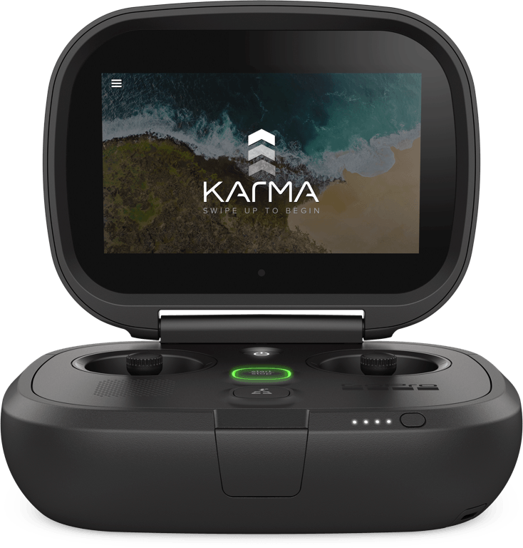
The GoPro Karma drone is the most user friendly drone on the market. The simple experience and minimal interface enables users to capture breathtaking aerial content.
My Role
While at at GoPro on the Karma team my work covered a wide variety of design challenges. From creating new interaction scenarios, user-interface design, creating a design system and hardware behaviors. I also created multiple prototypes that allowed me to work cross-team on multiple projects.
Design Opportunity
The karma drone was designed to enable new pilots to easily get into the air, capture content and then return safely. What made Karma stand out against the other drones on the market was the minimal interface. By designing a contextual interface we were able to ensure that only the most important information would be shown to the user when they needed it most.

“The controller is dead simple and fun!”
— Sean O’Kane @ The Verge
The Karma System
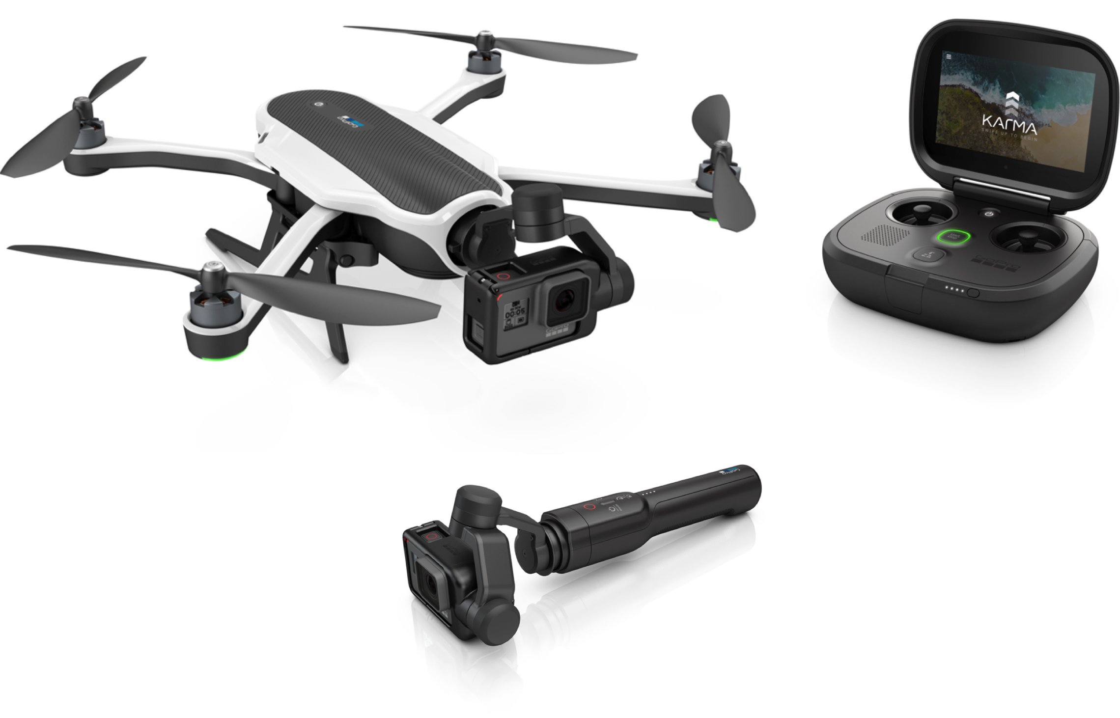
The karma system consists of a few main parts: the drone, the controller where the UI lives, the handheld grip and the stabilizer which houses the GoPro camera. The stabilizer is also removable so that it could be used with both the drone and the handheld grip.
Flight HUD
Most of the users interaction with Karma was spent on the Flight HUD which provided users with a live preview, access to their media, settings, camera modes, shot paths and notifications. Piloting a drone can be intimidating so we as a design team took great care to make sure that the interface never felt overwhelming and no matter where you were within the UI you were always one step away from the Flight HUD.

Auto Shot Paths Redesign
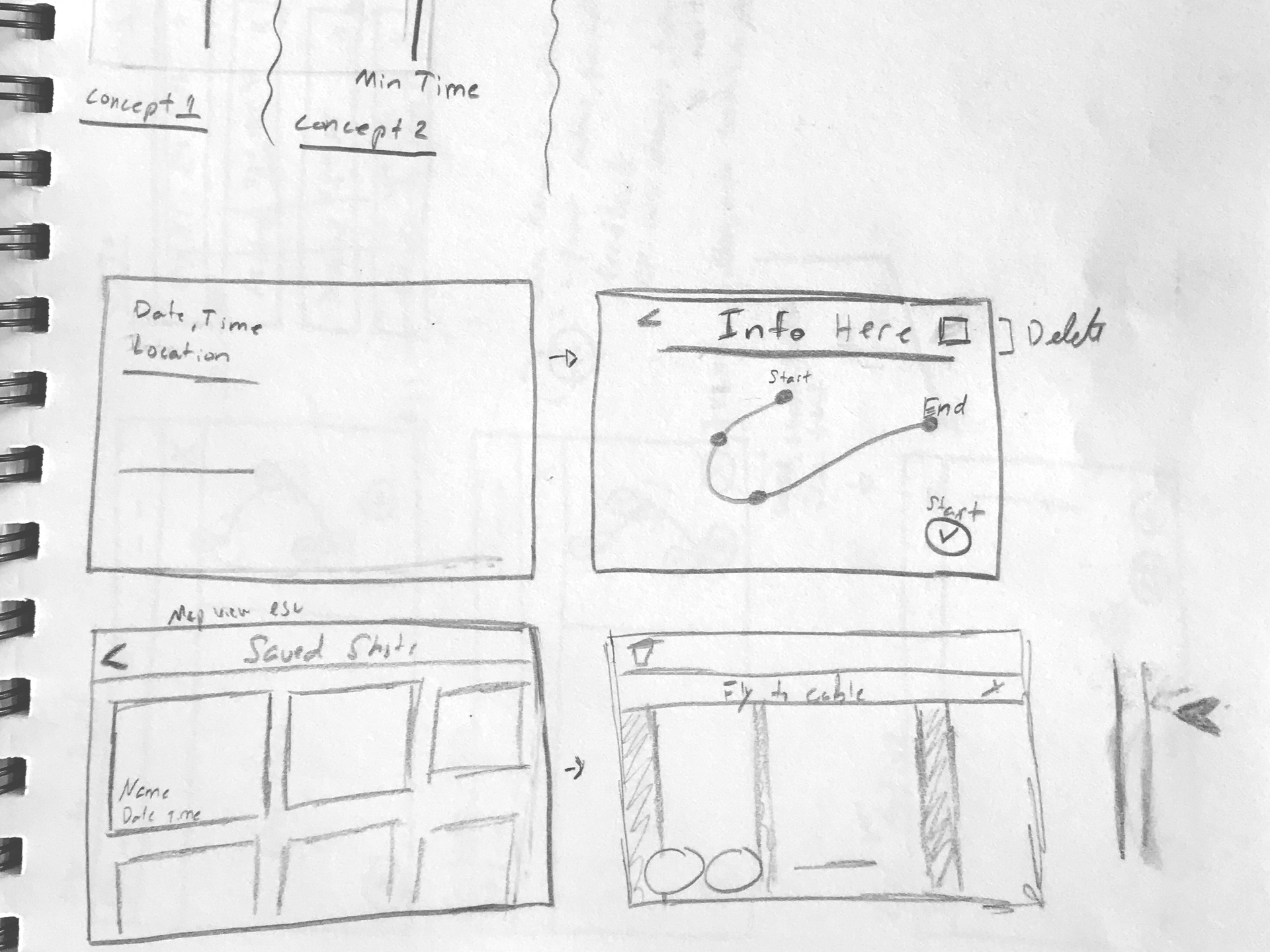
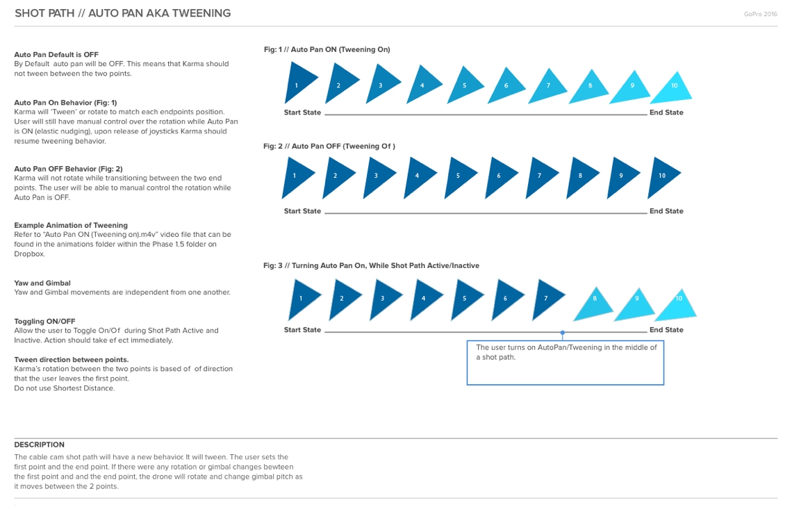
The shot path features closed the gap between novice and professional pilots by allowing users to easily create pre defined flight paths that resulted in beautiful cinematic shots. I was the lead designer on the auto shot paths update, released late 2016. I was responsible for improving upon the existing experience as well as ensuring the design could scale for any additional shot paths that could get added. We ended up releasing two new moves with the update, Multi-Point Cable Cam and Follow Me. Before the redesign the Shot Paths list included Dronie, Cable Cam, Orbit and Reveal.

Shot Paths
Design Evaluation
After collecting feedback from our users, flight testers and reviewing the current auto shot paths experience, I found some areas for UX improvements: navigation, setup, discoverability and placement of certain iconography. There was also a lack of access to on screen flight controls.
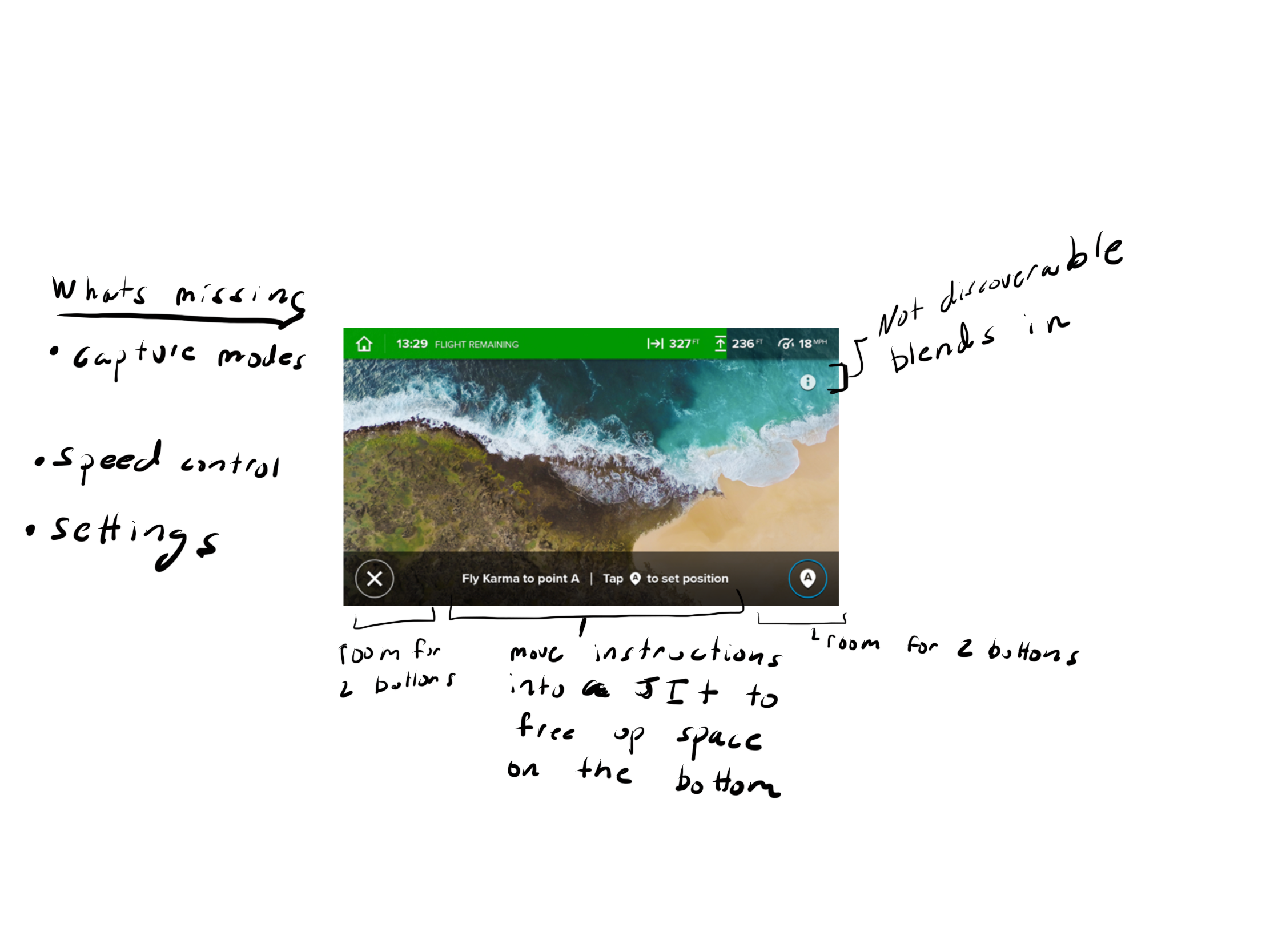
Auto Shot Paths - Old Design - Cable Cam Shown
Updated Design
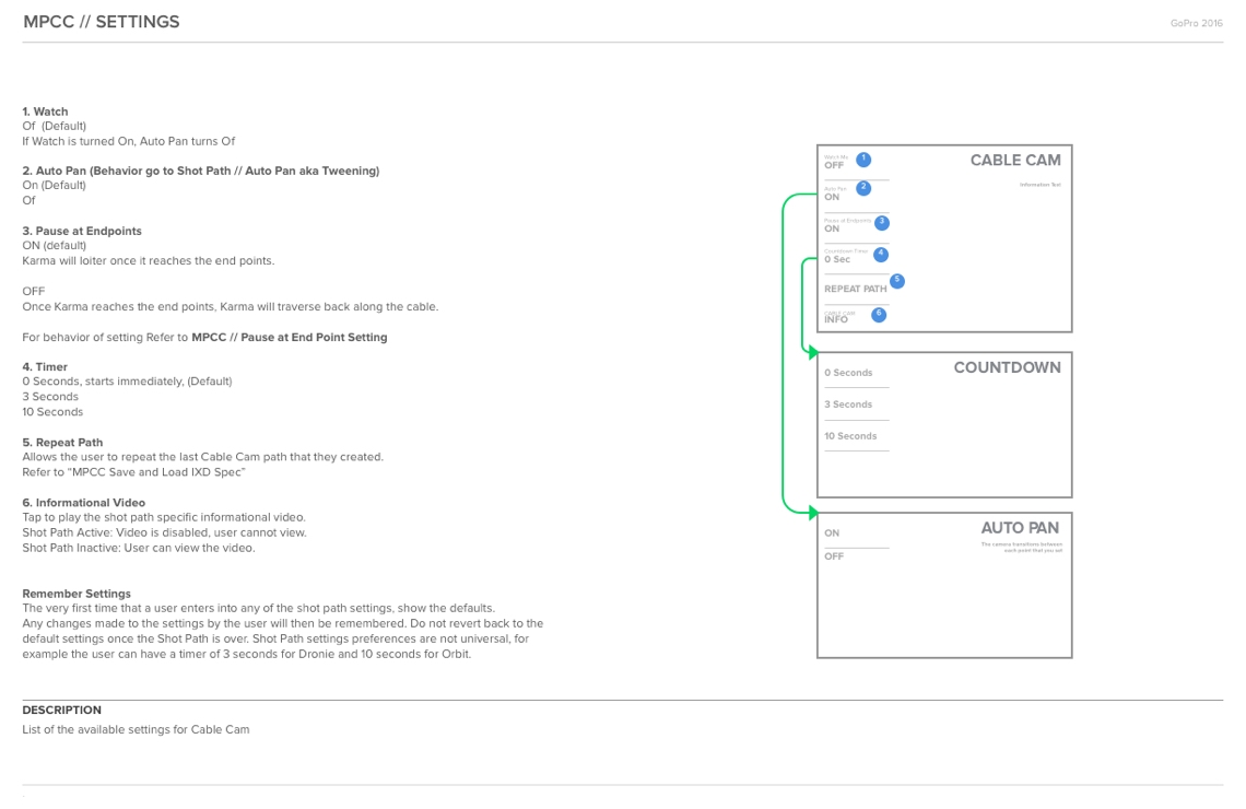
The new design that I created expanded upon the existing experience, and allowed the user improved control over the shot path experience. The ability to adjust the speed of the drone was now available during the setup, users could now access their video and photo settings and a dedicated settings area are just a few of updates that were added.

Auto Shot Paths - Current Design - Cable Cam Shown
Prototype
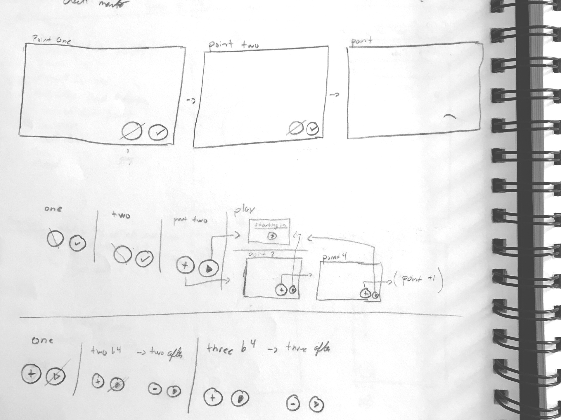
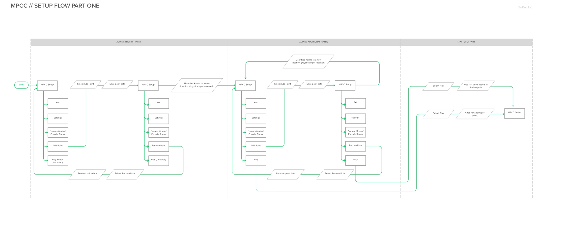
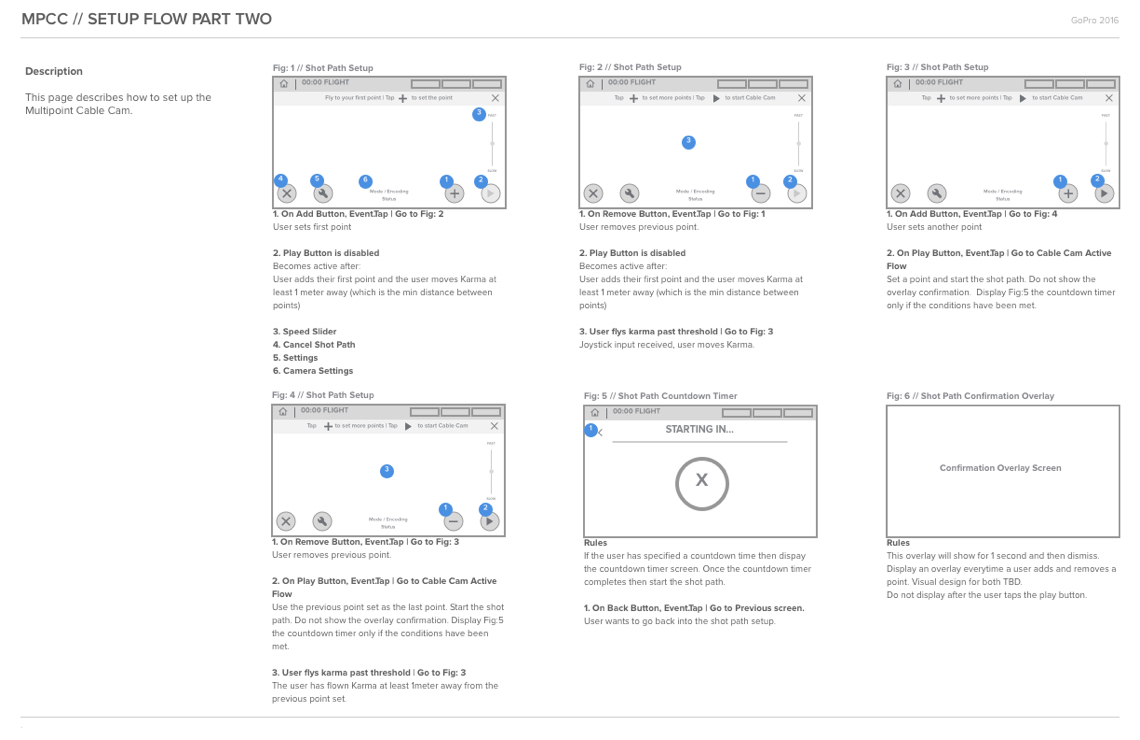
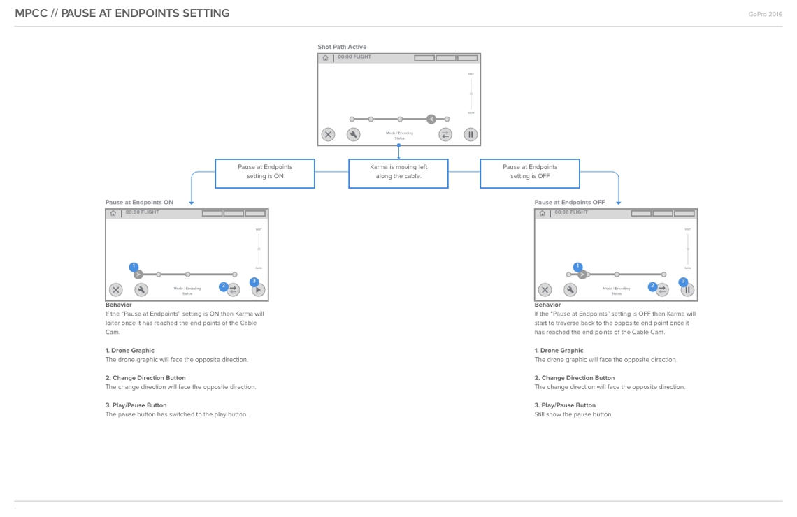
This prototype highlights the updated experience and the new shot path Multi-Point Cable Cam which expands upon the capabilities of the Cable Cam shot path. The user will select Cable Cam, set three points and then start the shot path.
Multi-Point Cable Cam - Created with Principle
Design System
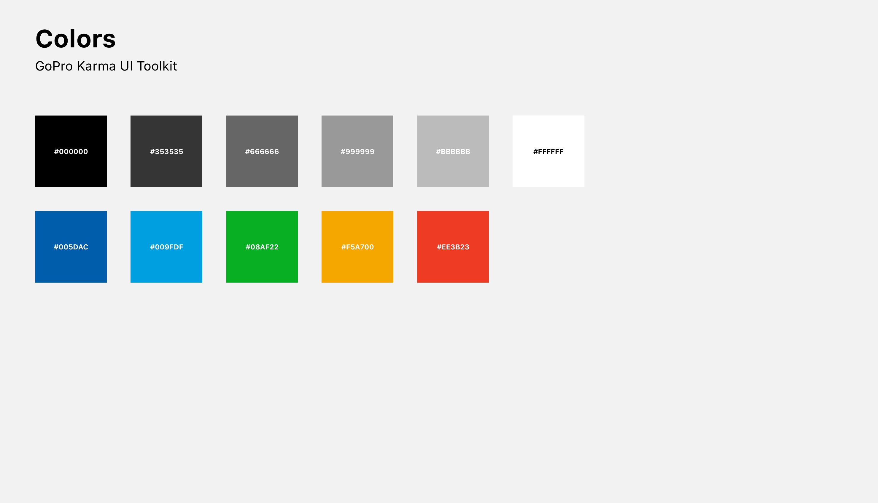
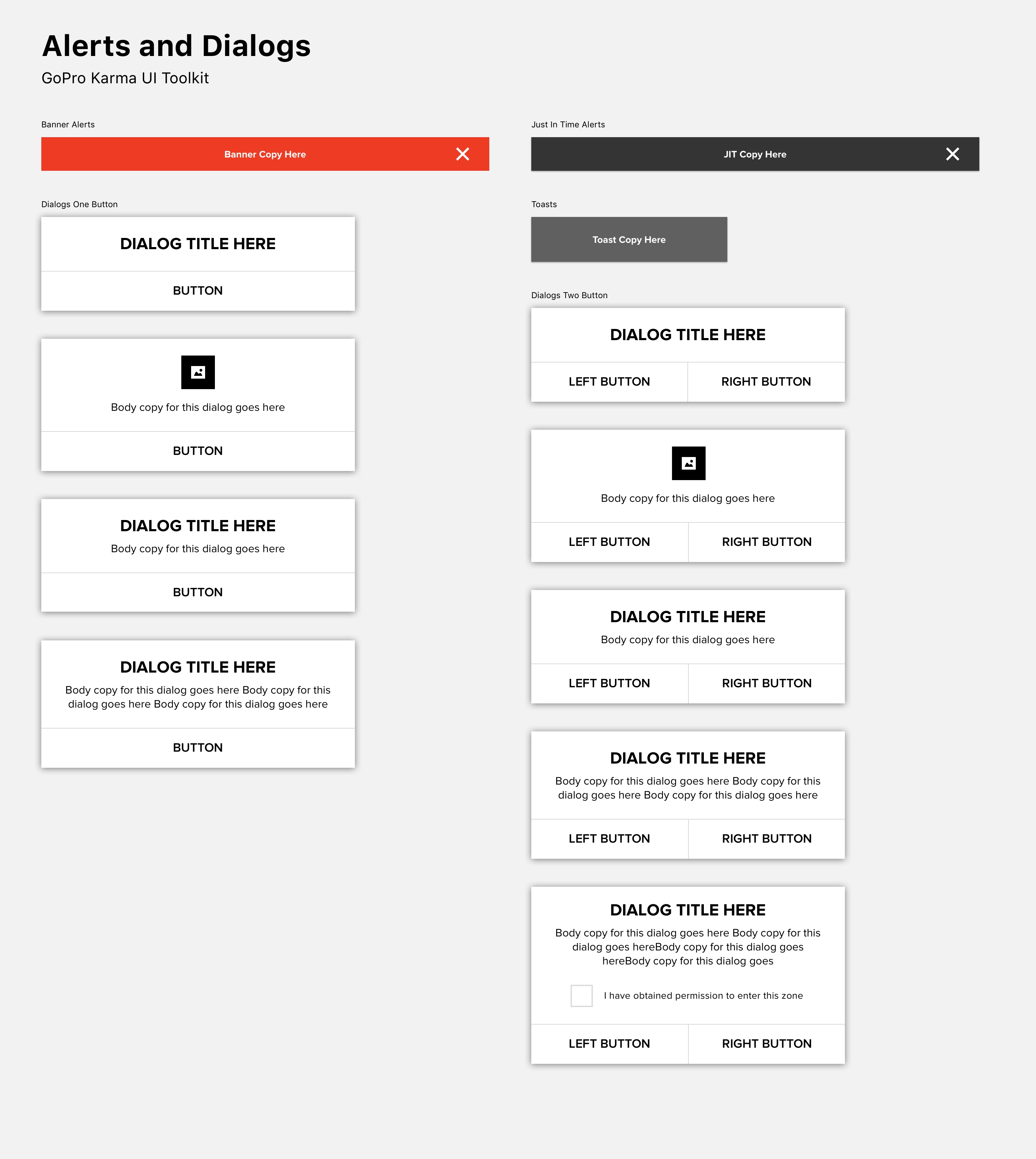
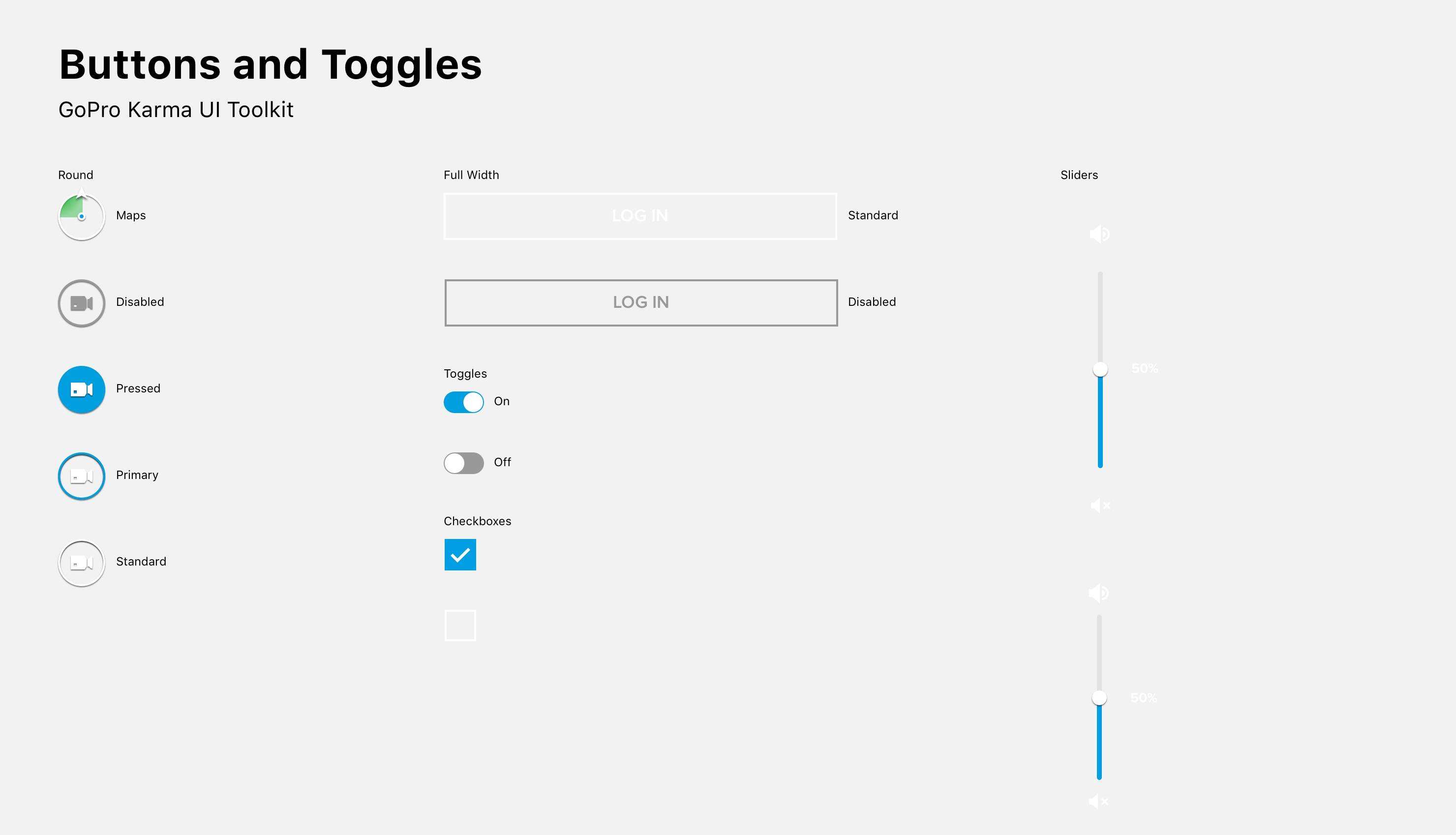
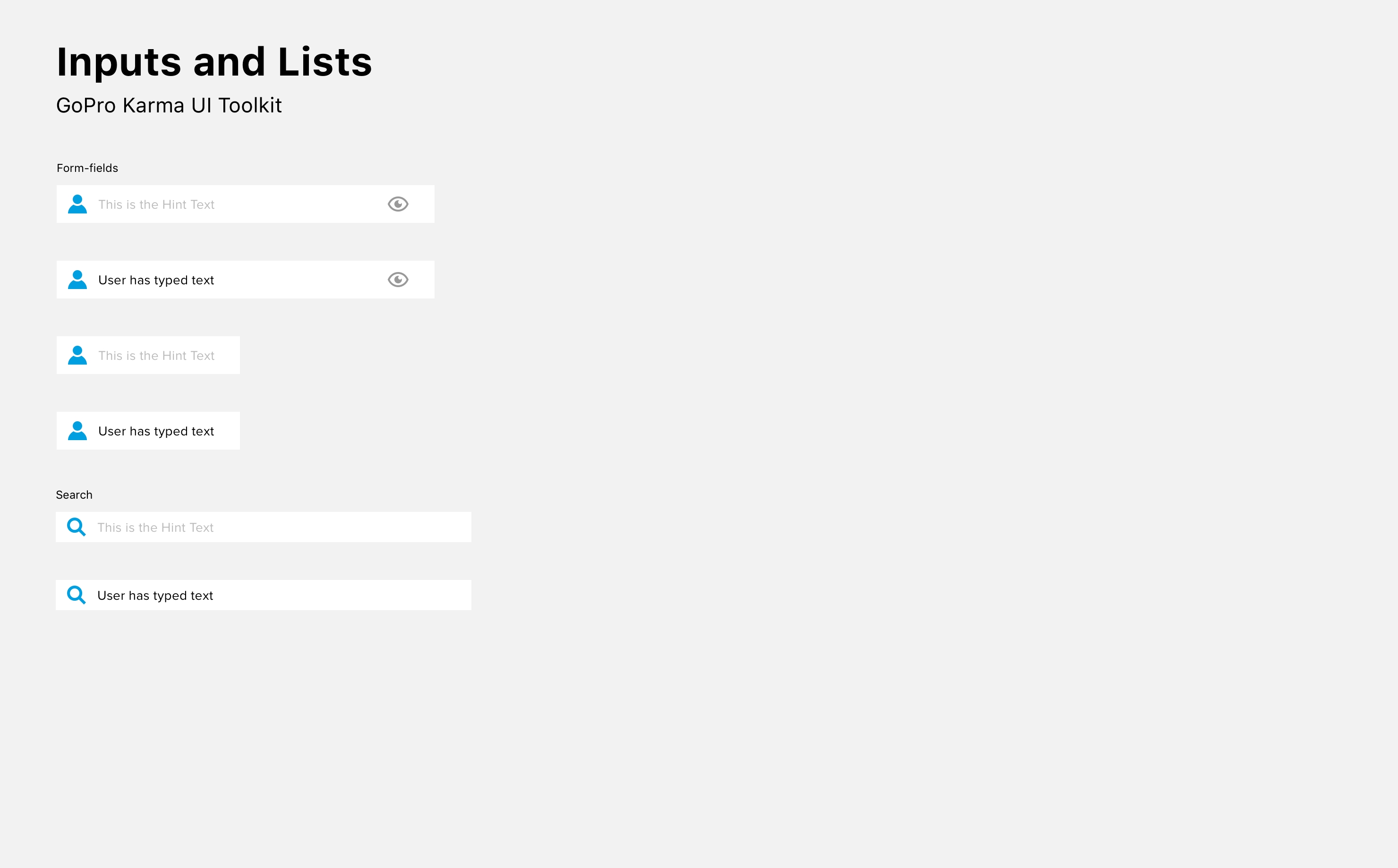
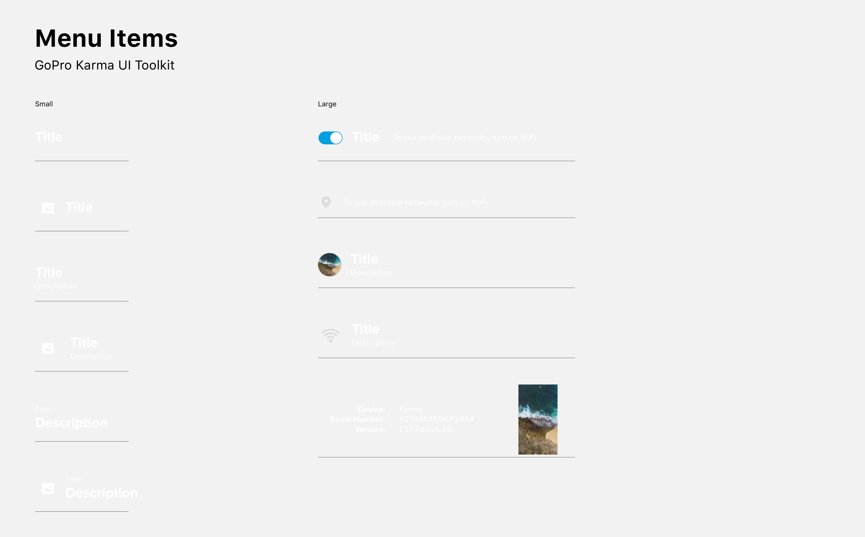
I was the sole designer on the creation of the design system for the Karma drone. The design system was not an official project, I saw an opportunity to improve the workflow for our design team. The end result was a robust list of sketch symbols that designers could leverage to quickly build out designs.
© COPYRIGHT 2021 ALXDAVID.COM

